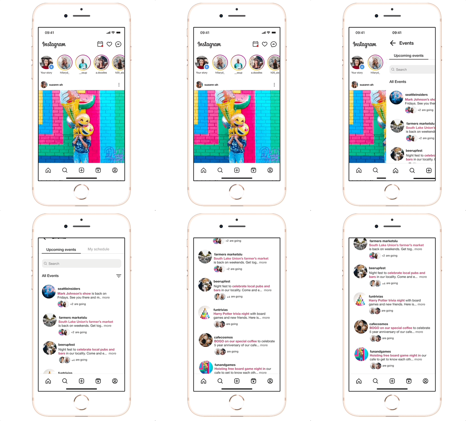
Introducing a new feature on Instagram
Instagram Events
This new feature aims at enhancing local event discovery and attendance on Instagram.
Role: UX Designer
Duration: 4 weeks
Responsibilities: UX Research, UX Design, UI Design, Interaction Design, Content Design, Prototyping
PROBLEM
Event discovery lacks centralization
The current event discovery feature on Instagram lacks location-based functionality, making it challenging for users to stay updated on local events. Additionally, searching for events using hashtags results in numerous, potentially irrelevant results, causing frustration and wasting users' time in finding preferred events.
““Our goal is to not just be a photo sharing app, but to be the way you share your life when you’re on the go.”
RESEARCH
Evaluating the competitors
In order to understand the workings of key market competitors in event hosting, I performed the following actions:
Created an account (as an event organizer)
Followed the steps to create an event and mark attendance
Compared and assessed the user-friendliness of each platform (as below)
Getting to know Instagram users
My Hypothesis : Young adults on Instagram, between 20 and 35, want a feature that lets them post their plans for events, check for their friends’ interest, and decide whether to attend the event or not.
During the first round of user interviews, I found that many active Instagram users weren't keen on posting about events. Instead, their interest lay in following certain pages to stay updated about events through Instagram.
This made me realize… My Hypothesis was wrong!
Young adults use Instagram actively to browse through their feed and stay updated on events based on the pages they follow. They aren’t interested in actively posting about it themselves.
Re-routing the research
Focusing on what users REALLY want
With a clear research objective and project scope in mind, I worked on a Research Plan addressing the needs of the users and then conducted second round of user interviews.
For the second round of interviews, the participants were a mix of instagram enthusiasts who seek local events through Instagram stories & posts as well as those who didn’t rely on Instagram for finding events.
Based on user insights and feedbacks on their Instagram journey, I created an Affinity Map to identify user needs, goals, motivation and pain points, ultimately gaining a deeper understanding of their requirements and areas of difficulty.
Prioritizing event attendees
Early on, I identified a crucial constraint: the Events feature could cater to two distinct user groups - event creators and event attendees. Given that my user interviews primarily focused on event-attendees, I made the decision to prioritize addressing the needs of this user group for the scope of this project.
Hence, from the interview brief 2 user personas emerged:
IDEATION
Mapping the user’s path within the app
I structured a Sitemap for my app, prioritizing features with an MVP mindset. I also ensured to focus my attention on the pages of the app that would most likely need to be created for usability testing.
Once I had the Sitemap sorted, I wanted to step into users' shoes, making sure their experience feels just right. So, I crafted Userflows & Taskflows to map out their journey.
The task flow was created keeping the following processes in mind:
Search for Upcoming Events
View your friends attending that event
Subscribe/ Set notification for an event
Check for scheduled events under personal events page
Check recommended events and follow the page
Early ideation - Low-fidelity wireframes
I discovered InVision Freehand during the bootcamp and found it invaluable for rapidly sketching low-fidelity wireframes remotely or when collaborating with other designers. I love to draw and sketch, but you save a lot of time with Freehand as you can quickly duplicate screens and components without wasting too much time on the details.
DESIGN
Conceptualizing ideas
Mid-Fidelity Wireframes
Transitioning my best concepts from sketches into simple digital wireframes allowed me to refine some smaller details.
By digitizing these screens, I was able to envision the potential outcome of my high-fidelity wireframes, allowing for a more tangible representation of the final design.
Style & Branding
Before starting with high fidelity wire-framing, I decided to create a UI component library which would serve as a style guide helping in maintaining consistency in high-fidelity designs. My UI component library consisted of both light and dark mode components because I has decided to design for both dark and light modes of instagram.
Breathing life into wireframes
Leveraging the UI component library, I elevated my mid-fi wireframes to polished hi-fi designs. The pre-built components streamlined the design process and ensured a consistent and finished look.
Dark Mode
TEST
Is the new feature relatable?
The users found the new feature engaging and intuitive, with a strong willingness to use it if introduced by Instagram. The feedbacks were very positive and the users were able to complete the tasks with 99% success rate.
The following 4 main flows were tested by the users:
FLOW 1
Search for Upcoming Events
FLOW 3
Check for scheduled events
FLOW 2
Subscribe/ Set notification for an event
FLOW 4
Check recommended events
I sorted user feedback efficiently using a prioritization grid, identifying and tackling key areas for improvement before finalizing the feature. This streamlined approach ensured the feature was optimized and user-centered.
Implementing modifications to enhance usability
DESIGN DECISION
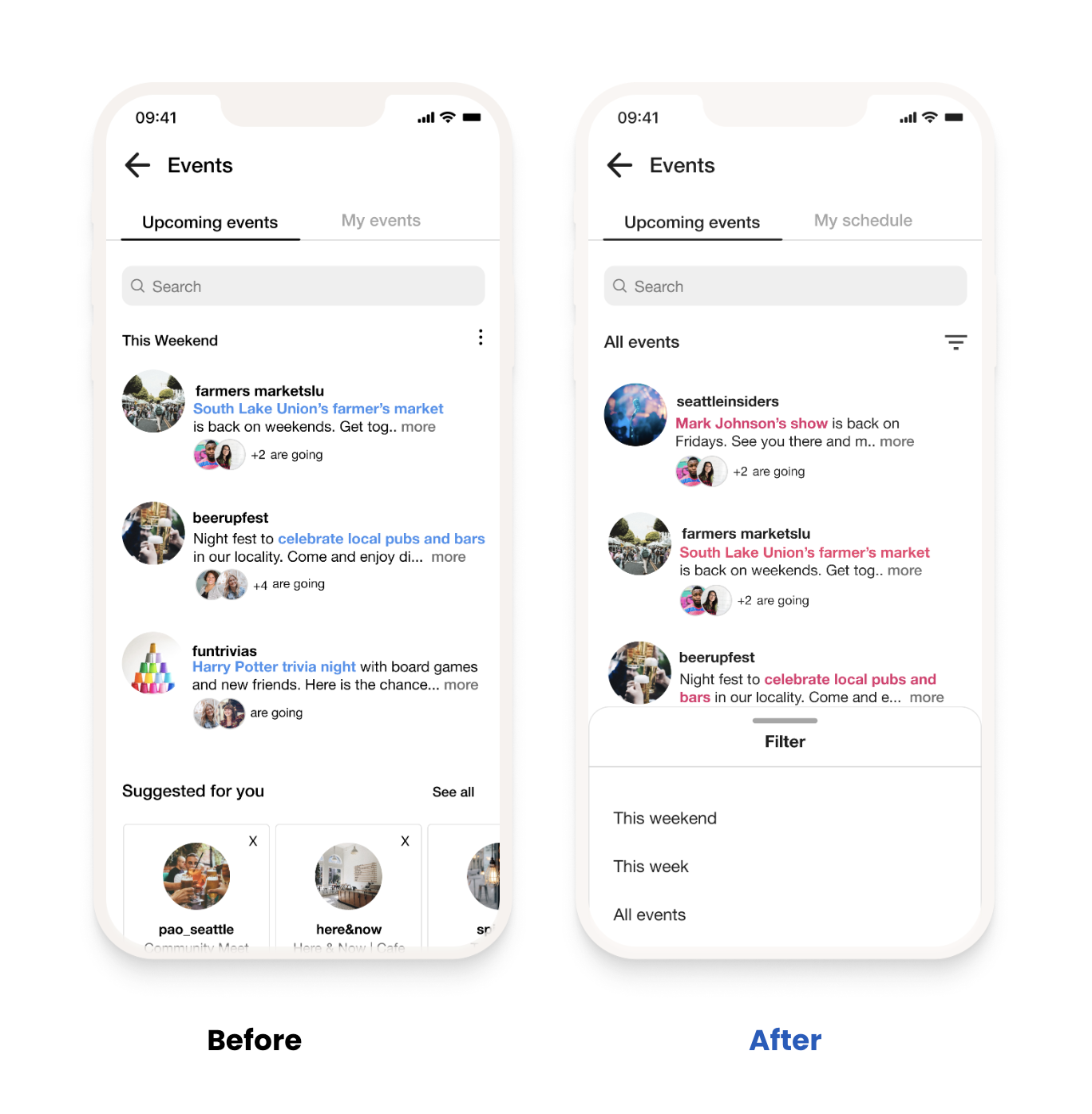
In order ensure user clarity and to clearly differentiate between the two, I re-named “My events” to “My schedule”.
DESIGN DECISION
Considering user needs and preferences, I integrated a filter to expand their search options and enable them to specify the days they are interested in.
DESIGN DECISION
To increase overall usability and reduced potential user confusion, the text color was changed from blue to pink to differentiate between a hyperlink and highlighted text.
DESIGN DECISION
The detail icon was removed, and a direct unsubscribe feature for events was implemented in its place.
DELIVER
Sealing this design journey
The Problem:
Instagram lacks a centralized feature that would enable users to discover & stay updated with events happening in their area.
The Solution:
An event discovery feature that enables seamless event notification, engagement, and coordination for a diverse range of local events.
The final output was an interactive, high-fidelity prototype tailored to user insights and feedback, ensuring it genuinely meets their needs. I aimed to craft a practical solution, not just a design.
NEXT STEPS
Where do we go from here?
Future Consideration
If I had more time and resources, a few things I would love to explore:
Explore features that could offer value to event organizers as well.
Monitor the growth and impact of this new feature.
Conduct user testing of our designs to iterate and improve the feature further.
What did I learn?
User Inclusivity: User’s perspectives played a pivotal role in designing a feature that resonates with diverse audiences, fostering inclusivity and engagement.
Iterative Design: Embracing an iterative design approach allowed us to refine the feature continuously, adapting to user needs and expectations with each iteration.
The Value of Feedback: By valuing user feedback, I leveraged existing Instagram experience to ensured a smooth transition, maintaining familiarity and enhancing user adoption.
Throughout the process of designing this feature for Instagram, I embarked on a journey of innovation and user-centricity. Diligently analyzed user feedback, tested prototypes, and made iterative improvements. My commitment to addressing pain points and enhancing usability led to meaningful results.


