Mobile App aimed at Reducing Food Waste
Vita Delica
An app that empowers home chefs to minimize food waste while discovering recipes tailored to their dietary preferences.
Role: End-to-end designer
Duration: 4 weeks
Responsibilities: UX Research, UX Design, UI Design, Interaction Design, Content Design, Prototyping
PROBLEM
Tackling food waste at home
In our world today, around one-third of all the food meant for us to enjoy goes to waste. This staggering amount, estimated by the United Nations (FAO), is largely due to households throwing away 30%-40% of the food they buy.
Home cooks often find themselves in a bind when ingredients bought for one recipe end up going to waste because they can't be used in others or find recipes that make use of leftover ingredients, leading to further food wastage.
“U.S. households waste approximately 76 billion pounds of food each year, which translates to about 25% of all food purchased. This wastage includes uneaten leftovers, spoiled produce, and ingredients that never get used, contributing significantly to the overall food waste problem in the country.”
RESEARCH
Learning from our competitors
In order to understand how are our competitors supporting or hindering the cooking experience of their users, I conducted a thorough Competitive Analysis of 4 leading recipe apps:
Epicurious, Samsung Food, SuperCook, and Yummly.
The detailed competitive analysis helped prepare me for the user interviews by giving me a better frame of reference for the types of resources our users currently had available. Also, identifying competitors' common strengths and weaknesses helped me identify elements to mimic or avoid in developing our product.
Apps diversify cuisine but neglect waste
In my research, I had one-on-one chats with 5 home cooks (aged 20-35) who faced food waste issues and wanted fresh recipe ideas based on what they had at home.
Initially, I struggled to uncover meaningful insights while mapping their actions. Feedback from peers reminded me to dig deeper into why they did what they did. So, I interviewed 2 more homecooks before re-evaluating the user interview notes. I re-did the Affinity Map which helped me find universal needs rather than addressing wants that only affected a portion of the research participants.
User interviews highlighted that while many apps introduce new cuisines, few tackle the issue of food wastage. Also, there are gaps in recipe discovery, especially regarding allergen safety and ingredient management, signaling a clear need for a solution.
The main issue lies in tackling food wastage.
Turning User Insights into Actionable Challenges!
Insight:
Users struggle with food wastage & finding nutritious ingredient substitution.
How might we:
Minimize food wastage and assist users in finding nutritious ingredient substitute?
Insight:
Users want an efficient way to manage their pantry.
How might we:
Create an efficient and user-friendly solution for pantry management to meet users' needs
Using the HMW questions, I brainstormed as many solution ideas as I could. I knew that making an app with limited features would help our new users to navigate easily. So I used the Product Roadmap to list the MVPs which was used as guidelines in the elimination process.
IDEATION
Brainstorming the site’s navigation
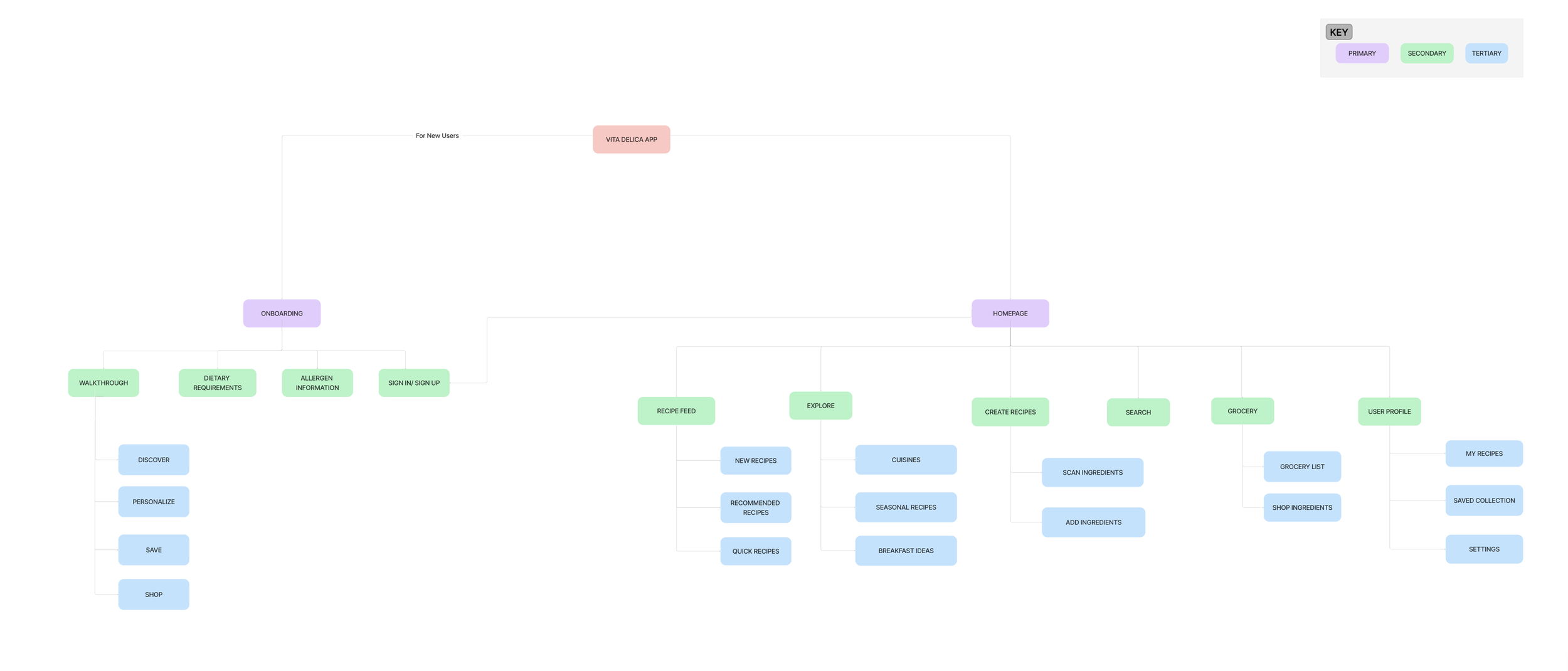
Utilizing insights from card sorting, I structured a Sitemap for my app, prioritizing features with an MVP mindset.
DESIGN
Focusing on the layout first
After establishing the website's information architecture, I began working on the low-fidelity wireframes. This helped me make decisions around logic and interaction design. I improved on the initial designs through rapid feedback collection and early issue identification.
Refining the content and design
Building upon the feedback, I advanced to mid-fidelity wireframes using Figma.
Design Decision
| Deciding on the integration of an in-app grocery shopping feature or not.
I revisited the Feature Roadmap and insights from user interviews, ultimately concluding that due to users' concerns about high delivery costs and a preference for physically shopping for ingredients, the inclusion of an in-app grocery shopping feature was not viable. As time was limited, I prioritized the implementation of only the 'Must-have features' outlined in the Product Roadmap.
Building the aesthetics
STYLE AND BRANDING
While working on the mid-fidelity wireframes, I had already established components, selected a font pairing (Playfair Display & Poppins), an icon set, and had a clear vision for the color scheme.
Understanding that warm colors tend to stimulate appetite, I chose the following colors for the brand:
Earth Tones ( Browns and Greens): Earthy tones like warm browns and soft greens can evoke a sense of nature and organic ingredients, which is often associated with home cooking. These colors can create a warm and welcoming ambiance, making users feel comfortable and at ease.
Creamy Whites: Creamy whites can be used as the background color to provide a clean and fresh canvas for recipe content. It enhances readability and makes food images stand out. White is also associated with cleanliness and simplicity.
ACCESSIBILITY CHECK
Each color combination from the brand palette was tested against the background color to ensure compliance with WCAG's AA contrast criteria.
Breathing life into designs
After a comprehensive assessment of the mid-fi wireframes by my Mentor, I created high-fidelity wireframes for Vita Delica by infusing it with color, branding elements, and engaging imagery.
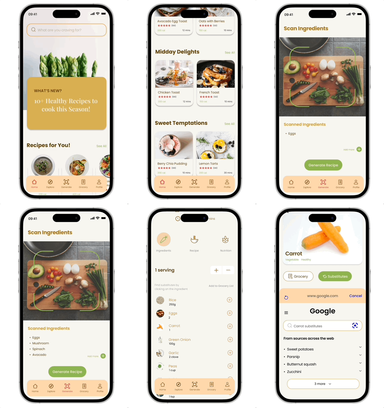
Here are some of the primary screens of Vita Delica:
I linked the screens to create three prototypes, each representing these primary flows :
FLOW 1
Onboarding screen to know user’s dietary preferences
FLOW 2
Scan ingredients to generate recipes.
FLOW 3
Finding ingredient substitute in recipes
TEST
Moment of truth
I conducted a usability test with 6 participants, aged 25-35, representing diverse home cook demographics. Their feedback was organized using matrices for focused revisions.
The outcome was highly favorable, with users successfully completing tasks.
However, some specific points in the tasks posed challenges for users, indicating areas that required more intuitive design solutions.
Although there were significant improvements in usability, users still encountered confusion with three specific elements:
“Create” in navigation bar
“Recipe ingredients” are clickable
Make “Explore”page more intuitive
ITERATE
Enhancing the app’s usability
Here are key design iterations I implemented and the rationale behind each change:
DESIGN DECISION
Changed the label of the 'Create' icon in the navigation bar to 'Generate' based on user feedback. This adjustment was made as many users found 'Create' to be unclear in the context of recipe generation from leftover ingredients.
DESIGN DECISION
To enhance user understanding that ingredients can be clicked, I introduced a clear instruction. I also switched the color of the check icon from red to green as green signifies completion more effectively.
I also implemented a real-time grocery addition indicator to show items being added to the list as you go.
DESIGN DECISION
I redesigned the Explore page to match user expectations, ensuring they discover a recipe feed upon clicking 'Explore.' Furthermore, I integrated smart filters based on the previous Explore page design to elevate the experience.
DELIVER
Sealing this design journey
The Problem:
Home cooks were concerned about minimizing food waste while also seeking out new recipes that align with their dietary preferences.
The Solution:
Vita Delica addresses the issue of food wastage by guiding home cooks to explore diverse recipes using their leftover ingredients and provides a wide range of culinary delights keeping in mind users’ dietary preferences.
My final deliverable consisted of an interactive, high-fidelity prototype meticulously crafted to align with the invaluable insights and feedback collected from users throughout the design process.This prototype was carefully shaped based on what users told me, ensuring that it really serves their needs. My goal wasn't just to curate a design but to create a real, practical solution.
NEXT STEPS
Where do we go from here?
Future Consideration
As this project concludes, here are some potential improvements I would like to make if I were to revisit this project:
Since many users find it challenging to use their mobile devices while cooking, I plan to explore smart voice assistance that users can interact with for cooking guidance.
Explore the seamless integration of this app with accessibility-enhancing devices to cater to a wider audience.
Conduct a follow-up round of usability testing to validate the effectiveness of the design iterations in addressing the previously identified usability issues.
What did I learn?
Holistic Perspective: It’s important to consider the entire user experience, from app interaction to broader context, including how users cook in the kitchen. This ensures a more comprehensive and effective solution.
Iteration is Inevitable: A design is rarely perfect from the start. Multiple iterations, fueled by user feedback, are essential for refining and improving the design.
Balancing Features: Striking a balance between adding features for functionality and maintaining simplicity for usability is crucial.


